Discover usability issues with the onboarding flow for the QuestMobile Application
Project Overview
🚀 Background
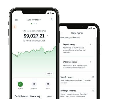
The QuestMobile OAA flow guides new users through the onboarding process, where they create an account, verify their details, provide personal information, and sign necessary documents. Understanding this journey is essential for the business, as it shapes a user’s first impression of the Questrade experience.
📌 PROJECT SCOPE
Timeframe: 5 weeks
My Role: Senior UX Researcher
Methods: Data analysis, Usability Testing, A/B Testing
Tools: Figma, Miro, UserTesting, power bi
Team: 2 Researchers, 2 Designers, 2 Product Manager, 2 Developers, 1 Data Scientist
🔎 OBJECTIVES
Analyze Drop-Off Rates: Identify which screens in the QuestMobile OAA flow have the highest drop-off to gain quantitative insights into where users are exiting the process.
Evaluate User Experience: Conduct moderated usability tests with potential investors to observe their onboarding journey, uncover usability issues, and understand pain points that may contribute to drop-off.
✏️ NOTES
This is a project I initiated to support the company’s quarterly goal of increasing customer acquisition. As a user, I noticed that the onboarding flow wasn’t as intuitive as it could be. Given the lack of research and ambiguity around its effectiveness, I set out to analyze drop-off rates to identify potential friction points. This analysis revealed significant drop-off areas, leading to usability tests to better understand the user experience and uncover opportunities for improvement.
🏅 QuestMobile OAA Analytics Review
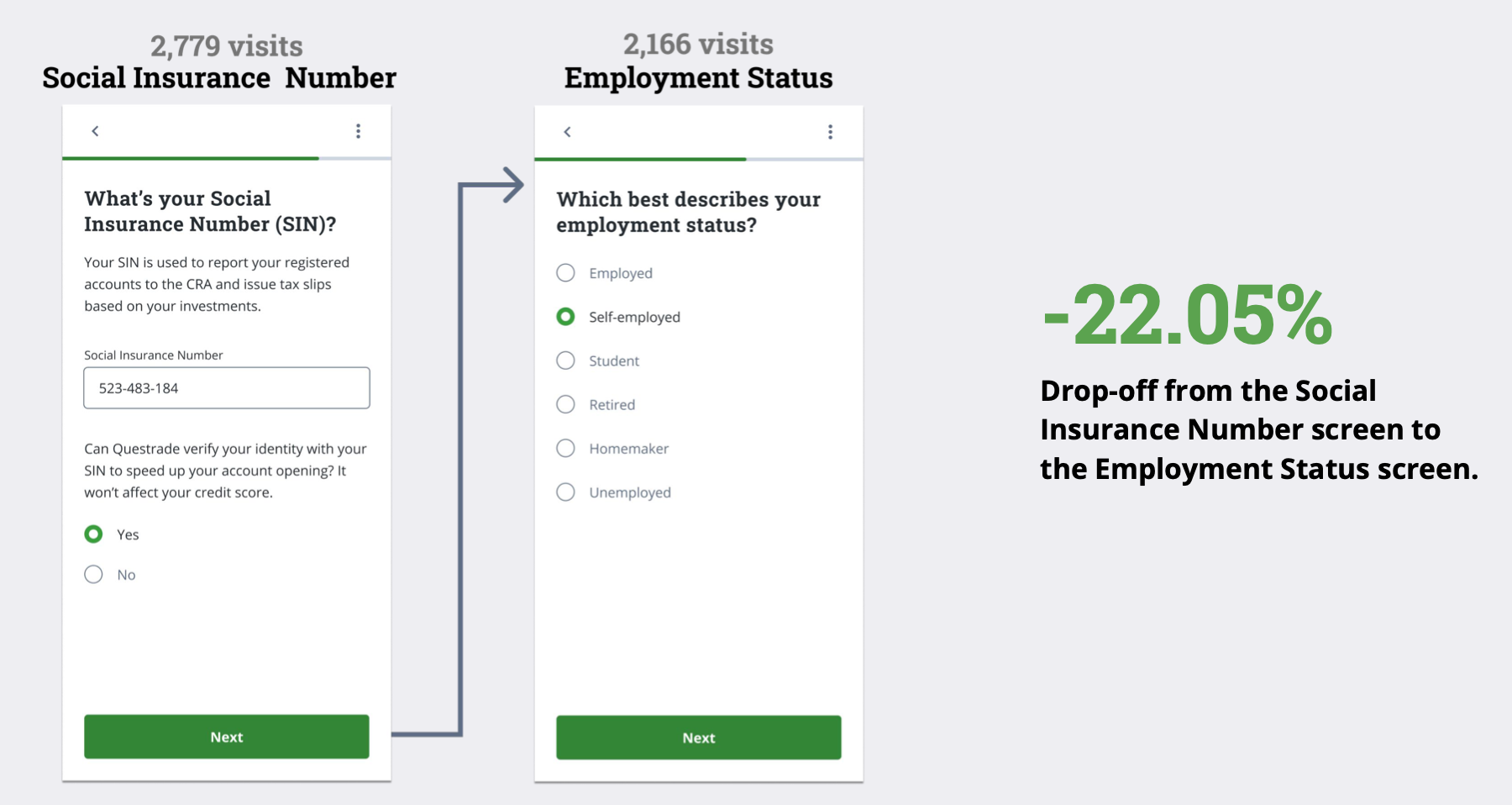
Visualization of the Onboarding flow and drop off rates for each screen
Findings:
👥 QuestMobile OAA Usability Test
After identifying high drop-off areas, we brainstormed assumptions about potential causes—such as usability challenges, technical barriers, or unclear instructions—and sought to validate them through live usability testing. We conducted live usability tests on the QuestMobile application to uncover friction points, technical issues, and user pain points.
Why This Matters:
Validates Assumptions with Real Users: Ensures that suspected pain points are actual barriers, allowing for targeted improvements.
Uncovers Hidden Friction & Technical Issues: Identifies usability challenges and bugs that may not be apparent from analytics alone.
Enhances User Experience: Provides actionable insights to refine the onboarding flow and create a smoother, more intuitive process.
Methodology
Conducted 8 moderated usability tests on the live QuestMobile application with non-investors who have a strong interest in investing. Participants were carefully selected to reflect the target audience, ensuring insights were relevant to potential users of the platform.
Why This Matters:
Tests with the Right Audience: Ensures feedback comes from users who are likely to engage with the platform, making findings more actionable.
Identifies Barriers for New Investors: Reveals usability challenges, confusion, or friction points that could deter first-time investors.
Optimizes Onboarding & Engagement: Provides insights to refine the experience, making it more intuitive and accessible for potential users.
Key Findings:
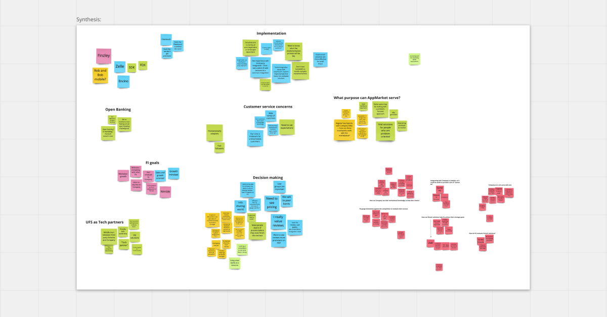
Affinity mapping
Affinity mapping is a collaborative method for organizing and analyzing qualitative data from usability tests. It involves collecting individual observations, grouping them into clusters based on shared themes or patterns, and then identifying key insights. Team members use sticky notes or digital tools to visually map out findings, allowing natural connections to emerge and transforming raw user feedback into actionable design recommendations.
The Process
We grouped things by which task/screen it was associated with. I made sure each sticky referenced the task and participant id
Within each task, we grouped things by their impact: positive, negative, and neutral.
After discovering themes across multiple interviews, we worked together to synthesize the data and agree on insights. From these insights, we created our first suggestions that would later become more polished recommendations.
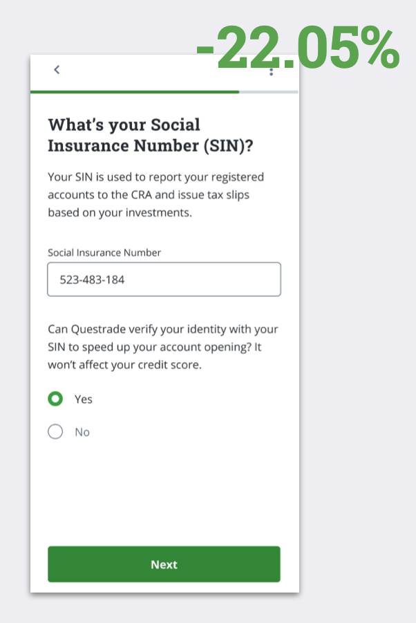
Fake Customer Profile Used for this study
We gave our participants fake profile data to input while opening a new account. This is because they were testing our live application, and we did not want them to use their own personal data.
Overall, the highest drop-off occurred at the beginning of the onboarding flow, as participants were still evaluating whether they wanted to open an account with Questrade. As they progressed and became more invested in the process, drop-off rates significantly decreased, indicating a stronger commitment to completing the flow.
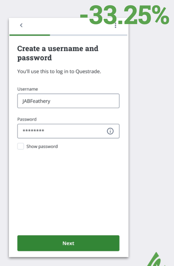
Screen: User Name and Password
It took participants multiple attempts to create a username and password that was acceptable. Issues included the following:
● The ‘Next’ button did not work and there was no error message when participants made small edits to an unaccepted username
● Participants did not notice or check the ⓘ icon for the password requirements before typing in a password
● Participants had to fix the username and password fields sequentially rather than simultaneously if both were
unacceptable, increasing the time spent on this screen
Experiencing multiple usability issues at the same time can cause frustration, reduce motivation to continue, and give a poor first impression of Questrade’s UX. Adjusting how and when error messages show up will allow potential customers to move on to the next step more quickly and successfully.
Analysis
Screen: SIN Page
There is a high drop-off on the SIN page because users often want more information on why their SIN is required. Additionally, many do not have their SIN readily available and need to retrieve it from their wallets, leading to abandonment. Some participants also felt that the SIN was requested too early in the flow, at a point where they were still deciding whether they wanted to open an account with Questrade.
Additional clarity is required
● Participants struggled to understand ‘liquid / fixed assets’ Even after reading the definition and examples on the page, participants were not 100% confident that they were calculating the correct asset values.
● Lack of context for why employer info is required Participants did not have an issue sharing their employer address or phone number, but several asked why they had to do so. Adding additional assurance that Questrade will not contact their employer would be helpful on the employer phone number screen.
An example of the design changes made to the screens.
Proposed edits are reviewed by the appropriate stakeholders to ensure alignment with user needs, business objectives, and technical feasibility. Changes are either approved for execution or modified based on feedback.
Once approved, the development team implements feasible changes into the live product, ensuring a seamless and improved user experience.
How does the placement of SIN information collection impact user completion and drop-off rates in the onboarding flow?
Hypothesis
Methodology
Key Metrics
Agreements were hard to read
● The Agreements documents were not mobile-friendly, and were very difficult to read on a phone screen without zooming in and out constantly.
● Participants felt that these documents were overwhelming and exhausting to look at. They were worried they would be signing something they should not. Since they cannot move on to the next section without looking at and clicking on ‘I Accept’ for all four agreements, improving the mobile-friendliness of these documents would be very helpful.
📊 Design Changes
Why This Matters:
Ensures Cross-Team Alignment: Brings together key stakeholders to align on next steps and feasibility.
Prioritizes Impactful Changes: Helps focus on the most effective solutions that balance user needs, technical constraints, and business goals.
Streamlines Implementation: Organizing recommendations in a structured format allows teams to act efficiently and make data-driven improvements.
Design Workshop with Stakeholders
To facilitate decision-making, I created a table to consolidate all recommendations onto a single page, helping to clarify where effort is needed. In this workshop, we collaborated with stakeholders to prioritize recommendations based on user feedback, technical feasibility, and business practicality.
🏅A/B Testing
Results
Moving SIN collection later in the flow will improve completion rates as users will:
Have more context about the service
Feel more invested in the process
Have built more trust with the platform
A/B test with two variations
Equal split of traffic
3-week test period
Monitor quantitative data
Completion rates, drop-off rates on the SIN page
Version B (later placement) showed:
Higher completion rates
Lower drop-off at SIN step
💥 Final Results
Six months after implementing our redesigned onboarding flow, I conducted a comprehensive analysis to validate our user experience improvements. By tracking drop-off rates, we confirmed the effectiveness of our strategic changes, achieving a significant 25% reduction in user abandonment—transforming research insights into product success.
Methodology
Data analysis of drop-off rates
Usability testing
A/B Testing
Comparing Data after launch
I collaborated with the Data and Design teams to map screen names to page views for the onboarding flow in QuestMobile, which consists of four key sections: User ID Creation, Profile Creation, Account Creation, and Documents.
Why This Matters:
Identifies Drop-off Points: Pinpoints where users abandon the onboarding process, enabling targeted improvements.
Enables Data-Driven Decisions: Ensures accurate tracking to inform design and product optimizations based on real user behavior.
Aligns Cross-Team Efforts: Creates a shared understanding of user navigation, allowing Data, Design, and Product teams to collaborate effectively.

